
 Some more illustrations I’ve spotted on my travels through time and magazine space….
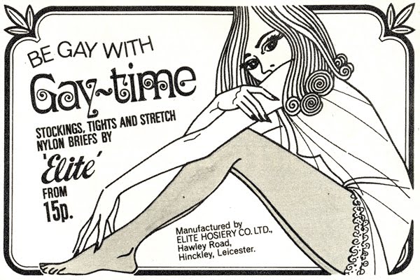
 Some more illustrations I’ve spotted on my travels through time and magazine space….
This may, at first, look like the laziest book review in the world. I can be a lazy person, tis true, but I couldn’t really think of a better way to review such an extraordinary book. It needs to be possessed, to be pored over, to be appreciated en masse and to be studied in fine detail.

Lifestyle Illustrations of the ’60s by Rian Hughes is one man’s personal project to bring those unsung illustrators of the period to the attention of the wider world. If you’re anything like me, they are a source of great fascination and inspiration when you flick through a vintage copy of Honey or Petticoat. And if you were reading Womans Own et al back in the day, they would certainly have inspired daydreams from their fleeting representations of the magazine’s romantic short stories. They are often small in size, but incredible in skill, style and social comment. The timeline element of the book also allows you to see the development of social aspirations, fashion styles, illustration styles and inspirations (the clear references to art deco and art nouveau styles) and attitudes to morals and relationships.


When I find them in the magazines, I try to remember to scan them in. But I’m a bit forgetful, so this doesn’t always happen. When I first laid my eyes and hands on this book, it was like heaven. Someone else has gone to the trouble of scanning them in, cleaning them up and collating them by date and crediting the artist where possible. Consequently, it feels a bit weird to scan in pages and individual illustrations to illustrate my review. Firstly, there are just way too many and my scanner is a bit fiddly (coupled with a big heavy book, whose spine I’d rather not break just yet). Secondly, because I want you to go out and get a copy yourselves. Words and scans can’t really demonstrate what it’s like to flick through such a book. Each page inspires a cry of ‘ooooh, pretty’. Well, that’s my reaction anyway. Scans wouldn’t do it justice.


So I decided to sit and flick and take photographs of the most ‘ooh’-inspiring pages. Of course I had to give up after about 20 photos because I realised I would end up photographing the entire thing. But here are the collated images, just casually snapped so you get some feeling of what it’s like. Unsurprisingly, I’m most taken with the later period with the psychedelic, art deco and art nouveau influences, but I’ve tried to show you a cross-section of the entire book.

Now all they need is to put on an exhibition. There’s something lovely about having them all collated into a book, but it can lessen the impact of some solitary works of art. I would dearly love to see them displayed as large prints.


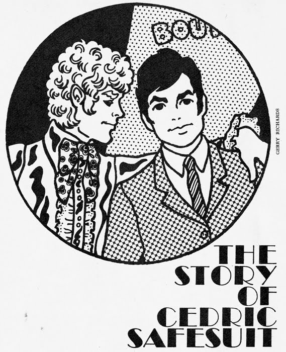
Also contained within the aforementioned July 1967 Petticoat magazine, is this superb illustrated feature on some extremely groovy menswear. Illustrated by Gerry Richards. Utterly brilliant and too good not to share…
Cedric Safesuit was a civil servant with good prospects and only one problem – all the girls rebuffed his advances with haughty stares. Why? Because Cedric was an acute and unhappy case of B.O. (boring outerwear).
Fortunately for our story, Cedric’s best friend Teddy Trend decided to take him in hand. King’s Road, he whispered at ever more frequent intervals. Carnaby Street, he muttered whenever the conversation flagged. Finally Cedric was worn down and, let loose among the gear shops, an astonishing change came over him. With whoops of delight, he tore off his old brown suit and signed cheques for everything he could lay his hands on. “I’ll never have B.O. again,” he said happily, walking off with Teddy Trend’s latest acquisition, a Twiggy-hipped redhead. “A severe case of B.H. (big head),” diagnosed Teddy sourly.
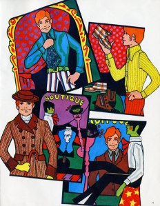 Michael Man’s Boutique blue satin shirt, 69s. 6d., with matching striped trousers, 69s. 11d., by Lord John, and printed blue kipper tie by Sydney Smith 21s.
New summer image in John Stephen His Boutique yellow seersucker shirt, 55s., matching orange seersucker trousers also by John Stephen, 65s., boots worth a second look, black and tans by Topper, 89s. 11d., tartan chucka boots, 45s. 6d.
Brown herringbone coat by Dandy, 21gns., John Michael flat hat for flat heads, 89s. 6d., white jabot for that dapper look by Dandy, 20s.
From John Stephen His Boutique white satin vicar shirt, 89s. 6d., red velvet bow from the Chelsea Antique Market, 12s. 6d., matching black trousers with white inverted pleat by Lord John, 79s. 11d., and a business-like black bowler with red cherries, 15s. at the Chelsea Antique Market.
 Two luscious illustrations from an April 1969 issue of 19 Magazine. Neither are credited. Both are amazing and utterly inspirational. Thank you, anonymous artists, for creating such works of beauty.

…could you have had a job agency who will find a job appropriate to your star sign. I wondered if it was a joke. Perhaps it was? I like to think I’d fit seamlessly into society if I ever fell through a wormhole in time and found myself in 1969, so I almost get annoyed with myself for finding such things so very amusing and bizarre. Perhaps I would have found them entertaining back then? I hope so…like the idea of sanitary towels aiding my search for a millionaire husband*?

*I was once accused of being a ‘gold digger’ by a former aquaintance of mine. It still perplexes me to this day. She can’t have been basing it on reality, if she’d ever met any of my boyfriends she’d know that. Perhaps she saw a packet of Dr Whites in my handbag?

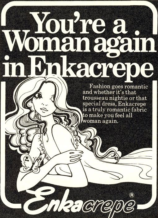
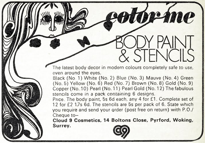
It’s a great disappointment to me that illustration seems to be such a niche market these days. There are occasional high-concept spreads in magazines (I know The Independent used to be very good at fashion illustration), and the odd one or two used to illustrate regular columns. But I’ve noticed, through my many old magazines, that illustrations used to be used to sell the most mundane products in the back of the magazines. Make-up, catalogues, pile cream, modelling agencies….ok perhaps I made up the pile cream one, but you get what I mean. Hell, one of them even advertises a Club 18-30 holiday…


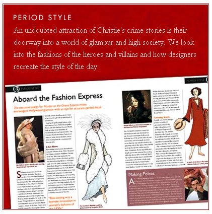 Look out for a brand new collection of Agatha Christie movies on DVD. Released on the 3rd of June, this collection, published fortnightly, comprises a DVD and an informative magazine that looks at the story and the characters with a behind-the-scenes journey into the making of the film.
Very excited to see that the Agatha Christie film collection is being released. The Orient Express one is particularly exciting because it actually features some illustrations by yours truly (see photo above). Oh yes! I was asked to do them last year, and will hopefully be doing some more soon. I’d actually forgotten about the entire project until hearing that it was getting a release this month.
Anyway, here’s the TV advert, which I keep catching the end of and flapping madly that I’ve missed my bit. That’s my stuff on there. Excitement and panic ensues….

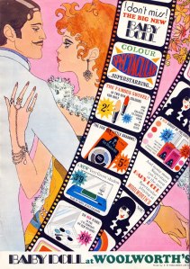
If I could find a huge batch of unused Baby Doll make-up, I’d be one happy bunny. Even if it had been used, I’d still happily display the gorgeous packaging. In fact, if I could be an illustration I’d probably be the Baby Doll girl. Yes I know that’s weird, but she’s adorable!

I don’t remember Woolworths (RIP) having a make-up range at all, so it must have been a Sixties/Seventies thing. Regardless, their adverts are amongst my very favourites of all vintage advertising.

