

Joanna Lumley, Kelly, J.J. and Roz Wilkins. 1970
Scanned from Jean Muir (exhibition book from 1980) by Leeds Art Galleries.
Joanna Lumley, Kelly, J.J. and Roz Wilkins. 1970
Scanned from Jean Muir (exhibition book from 1980) by Leeds Art Galleries.
Dear Mr Ferry,
There seems to be some sort of immense cock-up, re. your new album. Those wags at the record company appear to have placed something called ‘Kate Moss’ on the front cover. How strange! How careless! Perhaps they need a little reminder of what a Roxy cover girl should really be like.


How kind of you to take the blame for them, by saying it was all your own idea. You’re such a gentleman. Although a little foolish, for who could believe that the BryanGod would ever deem Kate Moss to be a suitable Roxy girl?
You see, the big problem is that I wish to purchase your [surely] superb new piece of work, but I have an allergic reaction to Moss and cannot, therefore, get within a mile of it without breaking out in a rash. What a dilemma! What a pickle!
I look forward to purchasing from you again in the future, when sanity has been restored.
Yours faithfully,
Miss Peelpants

Two beautiful photographs by the iconic photographer and artist Sarah Moon, from Vogue April 1972. Music by Noosha Fox. Calming me down on a stressful and miserable Monday…


Advert scanned from Nova, December 1972
 Caterine Milinaire. Step-daughter of the 13th Duke of Bedford. Photographed at Woburn Abbey at the beginning of the Sixties, and at a protest towards the end of the decade. Caterine worked for Vogue in the Sixties and wrote the now legendary ‘Cheap Chic’ book in the Seventies. Both photos scanned from Radical Rags.


Dress by John Bates at Jean Varon
An amazing Guy Bourdin photoshoot from Nova, December 1972.
I’m missing a precious Annacat/Ossie page (don’t even get me started on magazine sellers again…) but what’s left is still pretty amazing. Honestly, modern fashion photographers can only hope to come close to such works of art created by innovators like Bourdin.

Top: Sheilagh Brown for Coopers, Bottom and below: Janice Wainwright

Janice Wainwright

Dress by Bill Gibb

Top: Sheilagh Brown for Coopers, Bottom: John Bates for Jean Varon

Dress by Gillian Richard
 There are many reasons to slobber and pore over Dominic Lutyens and Kirsty Hislop’s superb book 70s Style and Design, but the most spectacular image, for me, is the incredible shot of Noosha Fox which opens this review. I really do struggle to do ‘regular’ book reviews; I just want to scan the pretty images and gush most tragically over the contents. Assuming the contents are gush-worthy, but you needn’t worry about that with Seventies Style and Design.
 From start to finish there are more lush visuals on offer than any other book tackling the era. It suffers, if suffering is exquisite, from the same problem as Marnie Fogg’s Boutique book in that, frankly, you’ll probably read it about twenty times before you actually come close to reading the text. I sat down, determined to read it from cover to cover for this review, and my determination was flagging after the midway point because I just wanted to gaze at the images. Which in turn got me thinking about the potential of a ‘double book’ where you have a separate tome dedicated to the images, and can sit down and properly concentrate on the written word; clearly researched extremely well and full of ‘new’ information, which just gets lost or swiftly forgotten amongst the visuals. Tricky, but well worth it, I reckon.
 Biba in Nova
My gushing only hesitates at two issues, which is quite amazing for picky little me. The first is probably too general to explain properly, the second is horribly specific.
Firstly, the ‘theming’ of the subject matter into edible chapter-sized chunks (Pop to Post-Modernism, Belle Epoque, Supernature and Avant Garde). I completely understand the motivation behind this, and the themes aren’t your average “chapter one: Psychedelia, chapter two: Glam Rock” type. Thank goodness. Thought and care has gone into them. But it’s always going to struggle a bit in an era which the authors even admit was something of a ‘free for all’ in its style and design themes. You could be forgiven for exiting from the last page with an idea that the Seventies was relentlessly fabulous, iconic and glamorous in its appearance. They even make punk look mouth-wateringly elegant. It is wide in its coverage, but it still orbits only in the atmosphere of what is now perceived to be interesting, beautiful and/or iconic. Which is a curious kind of Russian doll trap, given that the chapter on the Art Deco revival goes into the very interesting notion of cherry-picking from the Twenties and Thirties.
Page 73, 70s Style and Design
I’m not sure how self-aware the authors are, but it amused me to see this in a book which itself contributes to the modern synthesis of the Seventies into a more glamorous, louche and decadent era than most ‘average’ people who lived through it would recall. I know I’m guilty of much the same thing, especially when writing my blog and listing my wares, but I’m also deeply attracted to the more mundane, everyday primary sources. I love dull, contemporary documentaries, unfunny and borderline-gloomy sitcoms, films and dramas, pictures of slightly iffy looking people in iffy looking clothes and naff interiors and objets. It can’t always be high-gloss, high-sparkle.
I know examples of bad taste are ‘clichés’, but many great aspects of the Seventies are in danger of becoming as much clichés themselves. See the likes of Lady GaGa. When one becomes tired of Bowie, has one become tired of life? Sadly, I have found myself pondering this lately.
Saying that, it’s always wonderfully refreshing to read a book about Seventies design which doesn’t set out to sneer or incite howls of I-can’t-believe-people-dressed-like-that laughter.
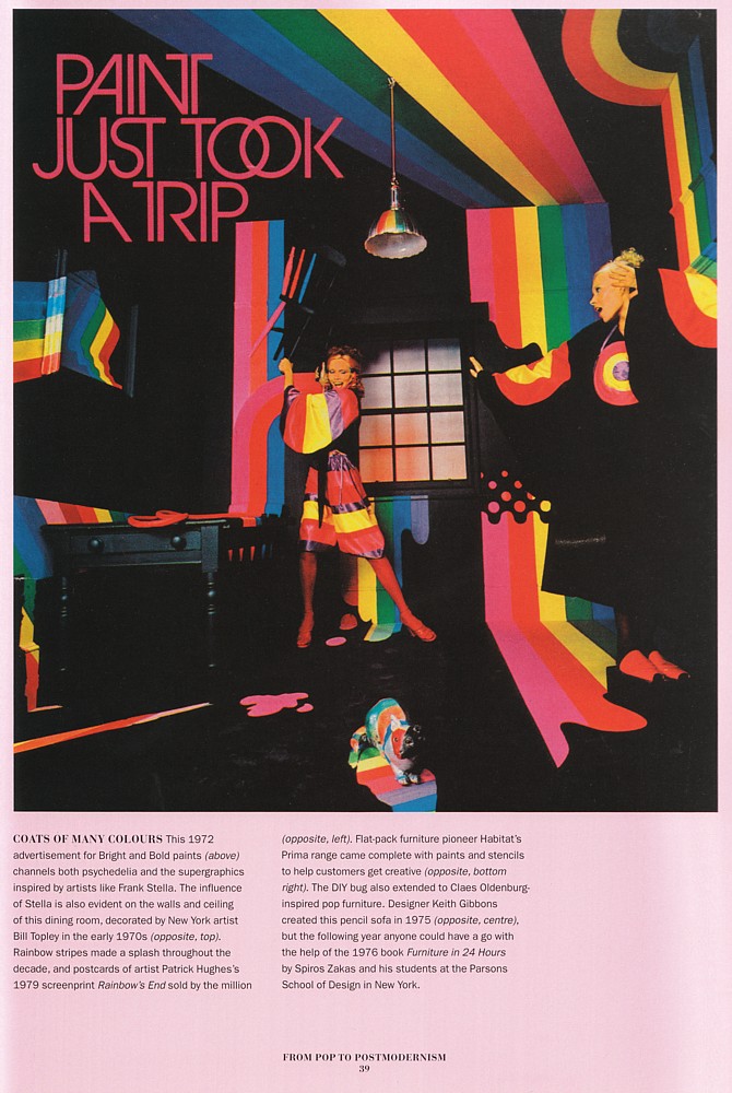 Amanda Lear in an advert for paint
Plus, high-gloss and high-sparkle are exactly what we need these days. And I don’t blame anyone choosing to jettison Gloomy Style and Design from their research, not least because the book would be twice the length and half the fun with those things included.
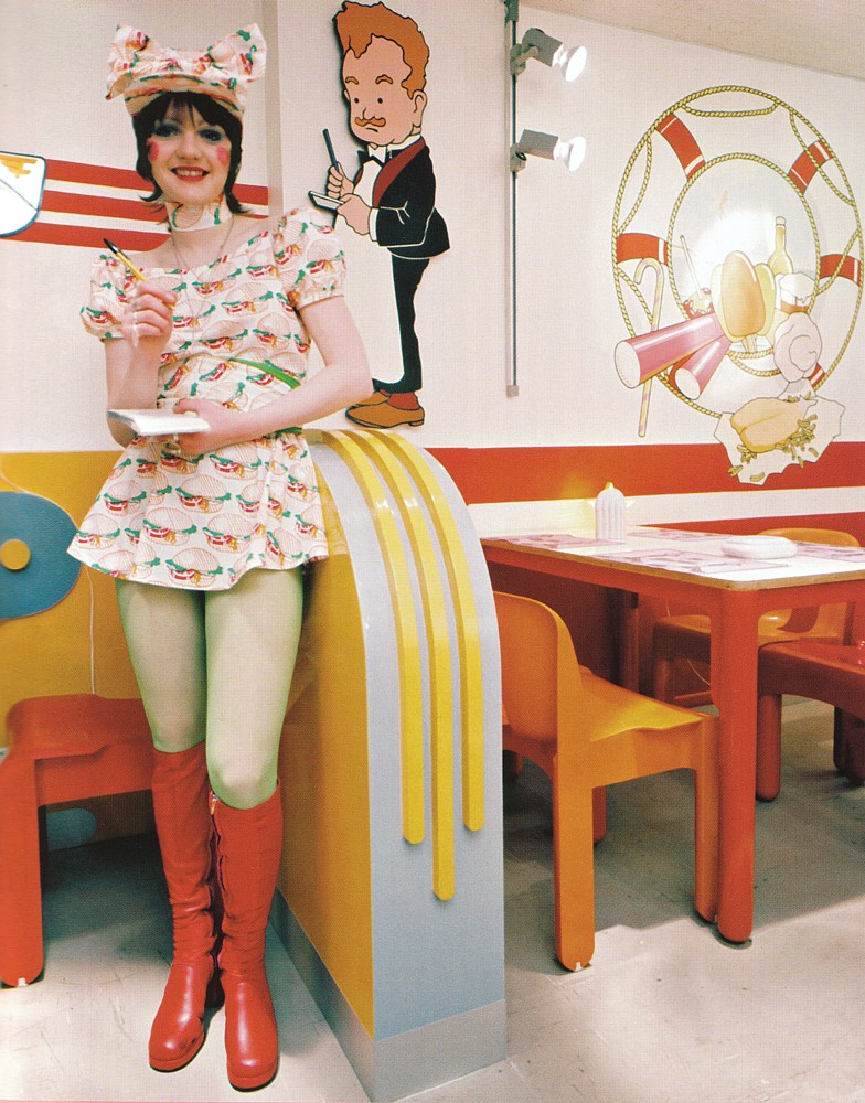 A waitress at ‘Mr Feed’em’
My second criticism, and it really is horribly specific, is the omission of Janice Wainwright. There! I said it was specific. If you want a pure-as-the-purest-spring-water example of the best of the Seventies aesthetic, I would say she was high up amongst the greats. Ossie, Biba, Mr Freedom, Bill Gibb are included, certainly, but Janice remains as yet unsung. In a book which gives us references to Universal Witness, Antony Price’s Plaza, Manolo Blahnik’s Zapata, Strawberry Studio and Kitsch-22, it seems a shame to leave anyone out!
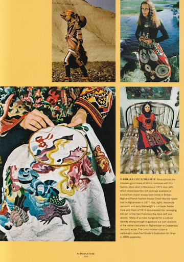 Mouth-watering textiles
What I love about the design of the book is that there are plenty of full-page, high quality images which have never been seen before, interspersed with a more scrapbook-esque mish mash of visual references. Adverts, photoshoots, posters, labels; some are annoyingly small but it’s just so nice to see them all included without any detriment to the written word. The inclusion of many lesser-known designers and characters is quite wonderful; I hadn’t encountered Thea Cadabra and her incredible shoes (see front cover) before, and now I’m a bit obsessed.
Also, any book which contains a half page reproduction of a Malcolm Bird illustration, the aforementioned full page photo of Noosha Fox and which uses the word ‘splendiforously’ is always going to take pride of place on my bookshelf.
Highly recommended for any vintage wishlist this Christmas (and beyond).
 Malcolm Bird’s illustration for Biba
 Drumroll please….
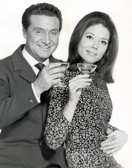
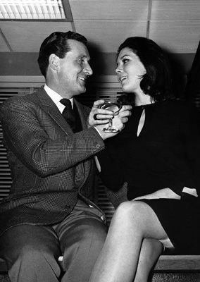
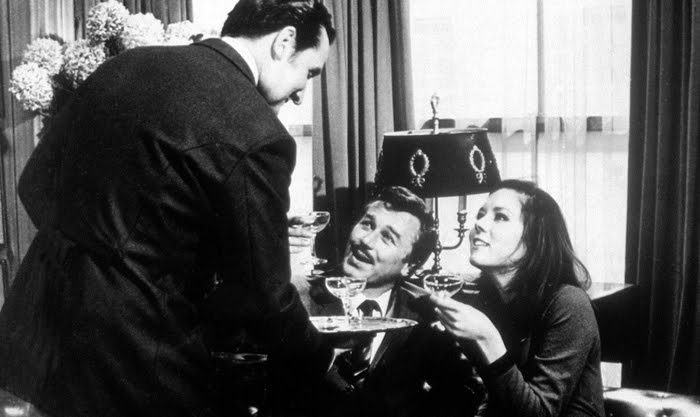
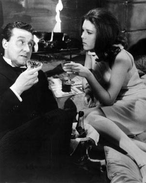
I don’t quite understand why the champagne ‘bowl’ or ‘coupe’ style of glass is so out of vogue in the world at large these days. Although this is nothing new, there is much I don’t understand about the world at large. For any fan of The Avengers, and assorted other Sixties films and tv shows, the coupe is surely the definitive silhouette?
For sure, there’s a certain novelty love for the Babycham-printed versions you often find in charity/antique shops. But all events, weddings and homes seem to be kitted out with the more ‘elegant’ champagne flute, and I’d be buggered if I could find any coupe-style ones once I started looking in charity shops.
I’ve been keeping my eyes ‘peeled’ for a while now, ignoring Babycham examples for their ubiquity, and was starting to despair of ever succeeding (with minimal outlay at any rate, they’re inevitably going to get broken in champers-fuelled high jinx when I am [clumsily] involved). Then, lo and behold, where should throw up a fine set of three (plus one slightly non-matching) for a mere £1.50 but East Grinstead of all places. I forgot to photograph them (for they now reside at M’s) but they probably don’t really warrant a photograph. They’re very simple, and simply do the job. Instead I will show you some photos of Steed, Emma and Tara enjoying their coupes…


 Five minutes down the road, I also happened upon the superb Trouble album by Sailor on vinyl for £1. Coincidence, much? For this album contains one of my favourite songs of all time, which is also the greatest Roxy Music song that Roxy Music didn’t do, A Glass of Champagne.
Steed and Mrs Peel-style clinkin’-drinkin’ elegance has been attained. And I will toast that….
I love collecting old press agency photos whenever I can, and frequently forget that I have them. One day I will have all the wallspace in the world upon which to display them. Until then, I must remember to scan the odd one for your delectation.

Cindy Présente Une Robe d’Automne
Voici déjà desmodèles de la mode d’automne etd’hiver. Il s’agit d’ici, d’un des modèles de la collection de Bill Gibb, de Londres, une robe au style “pré-raphael”, ample, à plis et brodée de fleurs, que CINDY présente avec grace.
4 Mai 1974 AGIP
I’m not quite sure how much grace Cindy is demonstrating in her modelling of a beautiful Bill Gibb dress, but it makes me giggle every time I look at it.

BIBA
254 Kensington High Street, W8
Biba, probably the best known of all the boutiques, began business six years ago with a mail order offer of a gingham shift and scarf for 25s, because fashion illustrator Barbara Hulanicki thought it was impossible to buy inexpensive well designed clothes and decided to do something about it. At the end of last year, in premises 16 times the size of the original boutique in Abingdon Road, Biba opened as a store selling not only clothes but also accessories, make up and home furnishings, Barbara Hulanicki’s distinctive style is carried through all her designs, sold only at the store and by mail order catalogue. She works with her husband, Stephen Fitzsimon.

Barbara Hulanicki in the store, where carpets and furnishings have all been designed with complementary colours and patterns. Child’s dress, 6 gns.

On the mezzanine floor. Crepe coat and trousers, 15 gns

Mirrored on the staircase: a slim crepe dress, 9 gns.

Printed Tricel dress, 9 gns.
Hair by Barbara Hulanicki. Photos by Duffy.
