Book review: The Faces 1969-75

alkasura, book reviews, bus stop, menswear, rod stewart, ronnie lane, ronnie wood, the faces

Ok, so this can’t possibly be a proper book review, because I don’t own the book. The reason I don’t own it, is because it costs £345. It’s £345 well spent, if you have the money, in my opinion. But it’s still £345. You pay for superior materials, lush production and great exclusivity; it’s bound (ha!) to hold/increase its value. It also contains a lustworthy amount of photos of rockstars in beautiful clothes.

I did, however, get to see a preview at the launch, at Genesis HQ in Guildford, on Tuesday night. Once the crowds had cleared somewhat, the feather-headed pseudo-mods had drifted away, I had spotted Peter Blake (again!! It’s the Zandra Rhodes effect; you start feeling bored of seeing them everywhere!) and gobbled up as many canapés as I could find, I carefully flicked through the book and tried to take some lousy phone shots of the photos up on the walls. I was in heaven. Men in satin. Men in flares. Men in feather boas. Men in platforms….

Rod in an Alkasura cherry jacket.

The "Bus Stop" blouse.

Men in blouses. Fantastic.

Funny Faces

Plonk!

Personally I’m a Ronnie Lane kinda girl. Rod Stewart is fine in this period, and he wears some of the most brilliantly bonkers gear out of all of them. Ronnie Wood is tolerable, but he doesn’t float my boat. Ian McLagan has instantly gained major points in my book for being seen wearing a Bus Stop Forties-lady print blouse throughout the book. And Kenney Jones is….there. But put them all together, and it’s just magical. The photos are largely unseen; vivid, candid and energetic.

I’ll just have to keep hoping for that windfall so I can buy the damn thing! The Faces: 1969-75 is available here:
http://www.genesis-publications.com/faces/default.htm

Duffy (finally)

1960s, amanda lear, book reviews, brian duffy, jean shrimpton, michael sarne, mild sauce, pierre la roche, seventies fashion, the sweet

Queen magazine, 1963

Although you’ll all have long since forgotten that I promised to review the fantastic Duffy book (published by ACC. RRP £45 but currently £31.98 on Amazon.co.uk), I certainly haven’t and it’s been rather weighing on my mind. In fact, I’m troubled by the fact that I rarely seem to have the energy to type long, rambling blog posts at all these days.

So, as I often do, I will largely leave the photographs to do the communicating. Which is rather the point of the book itself. It is not a weighty tome about the life of the man, rather it is a weighty tome about the talent of the man. The talent which made him world-famous, but eventually left him feeling so trapped he had to [pretty much literally] destroy it in order to escape it. Page after page of gorgeous women, swinging dudes of the highest and lowest order and generally Interesting People. But it also covers the later period, the advertising and the selling-out, or ‘prostitution’ as he honestly described it.

I have to admit, I’m always on the look out for new Duffy shoots in my magazines because I’m almost rather bored of seeing the same ones shown again and again. And to be fair, of course, in Duffy’s case there is the genuine problem with the complete lack of original source material. His son Chris has spent years reassembling the archive, and I have to respect the labour of love that this project has become. Thankfully, the book is more varied than the exhibition I attended earlier this year would lead you to believe. I have scanned a few of my personal favourites, which I hope will communicate the beauty of his work.

A pet hate must be noted at this point, which is that these books rarely identify the designer of the clothes worn in the pictures. I know it doesn’t seem like much to a non-clothes obsessive, but I want to know if that dress really was by so-and-so and I find it infuriating for such information to be left out when surely it must be known?

Obviously, luxuriously printed and sized books such as this require the highest calibre of image quality for reproduction purposes, but it would be nice, in a few years time, to see a book which features more obscurities, more magazine tear-sheets and clippings; covering the lesser-known styles and techniques he used. For there are many. I mean, David Bailey has had enough books about him to last a lifetime; Brian Duffy certainly deserves another one.

Definitely one for the Christmas list. And watch out, because I’m going to be reviewing more books to put on your Christmas list over the next few weeks. Yes indeed.

Amanda Lear, 1971

Sweet, 1970

Unidentified, 1960s

Jean Shrimpton, Vogue 1962

Average White Band album cover, 1979

Michael Sarne, 1962

Pirelli, 1965

Pierre La Roche, Aladdin Sane make-up artist, 1973

Alphasud Car, Henley on Thames, 1974

Mike Henry and Nancy Kovack, 1964

Inspirational Images: Barbara Mott, 1968

1960s, barbara mott, Inspirational Images, michael mott, paraphernalia, radical rags

In the late ’60s, the rock hall replaced the discotheque as as the prime area for innovative fashion display. “In fashion terms a Fillmore East opening night deserves as much coverage as the Philharmonic Galanosed Galas,” claimed the Village Voice shortly after the rock auditorium opened in March 1968. “It’s a scene-making pageant whether they’re seeing Lenny at Lincoln Center or Jimi at the Fillmore.” In 1968, Bill Graham…tied together the pageantry in the audience with the fireworks on stage when he organized a mini fashion happening during an interval in the evening’s mixed bill. Unheralded, Barbara Mott, wife of designer Michael Mott, zoomed up the center aisle of the rock palace on an enormous Harley Davidson. Dressed in Mott’s black leather bra top and miniskirt pegged with hobnail studs, she tore up a ramp to the stage and parked her vehicle to the accompaniment of a cannonade of cheers from the Fillmore’s audience.

Image and text from Radical Rags by Joel Lobenthal

Inspirational Images: Pat Cleveland in Stephen Burrows

1970s, Inspirational Images, pat cleveland, radical rags, stephen burrows

Scanned from Radical Rags. Photographer unknown.

What a difference a decade makes

caterine milinaire, radical rags, sixties

Caterine Milinaire. Step-daughter of the 13th Duke of Bedford. Photographed at Woburn Abbey at the beginning of the Sixties, and at a protest towards the end of the decade. Caterine worked for Vogue in the Sixties and wrote the now legendary ‘Cheap Chic’ book in the Seventies. Both photos scanned from Radical Rags.

70s Style and Design

70s style and design, amanda lear, biba, book reviews, david bowie, janice wainwright, malcolm bird, mr freedom, noosha fox, seventies fashion, thea cadabra

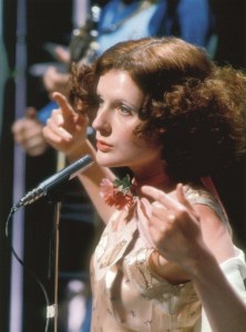
There are many reasons to slobber and pore over Dominic Lutyens and Kirsty Hislop’s superb book 70s Style and Design, but the most spectacular image, for me, is the incredible shot of Noosha Fox which opens this review. I really do struggle to do ‘regular’ book reviews; I just want to scan the pretty images and gush most tragically over the contents. Assuming the contents are gush-worthy, but you needn’t worry about that with Seventies Style and Design.

From start to finish there are more lush visuals on offer than any other book tackling the era. It suffers, if suffering is exquisite, from the same problem as Marnie Fogg’s Boutique book in that, frankly, you’ll probably read it about twenty times before you actually come close to reading the text. I sat down, determined to read it from cover to cover for this review, and my determination was flagging after the midway point because I just wanted to gaze at the images. Which in turn got me thinking about the potential of a ‘double book’ where you have a separate tome dedicated to the images, and can sit down and properly concentrate on the written word; clearly researched extremely well and full of ‘new’ information, which just gets lost or swiftly forgotten amongst the visuals. Tricky, but well worth it, I reckon.

Biba in Nova


My gushing only hesitates at two issues, which is quite amazing for picky little me. The first is probably too general to explain properly, the second is horribly specific.

Firstly, the ‘theming’ of the subject matter into edible chapter-sized chunks (Pop to Post-Modernism, Belle Epoque, Supernature and Avant Garde). I completely understand the motivation behind this, and the themes aren’t your average “chapter one: Psychedelia, chapter two: Glam Rock” type. Thank goodness. Thought and care has gone into them. But it’s always going to struggle a bit in an era which the authors even admit was something of a ‘free for all’ in its style and design themes. You could be forgiven for exiting from the last page with an idea that the Seventies was relentlessly fabulous, iconic and glamorous in its appearance. They even make punk look mouth-wateringly elegant. It is wide in its coverage, but it still orbits only in the atmosphere of what is now perceived to be interesting, beautiful and/or iconic. Which is a curious kind of Russian doll trap, given that the chapter on the Art Deco revival goes into the very interesting notion of cherry-picking from the Twenties and Thirties.

“A defining characteristic of all this Biba fuelled nostalgia or ‘retro’ – a word first coined, appropriately, in the 1970s – was that it wasn’t purist but pluralist. Many of its fans were too young to have witnessed these eras, and so interpreted them in whichever way they fancied, usually viewing them through rose-tinted lorgnettes and blithely glossing over such crises as the 1926 General Strike and the Great Depression.”


Page 73, 70s Style and Design


I’m not sure how self-aware the authors are, but it amused me to see this in a book which itself contributes to the modern synthesis of the Seventies into a more glamorous, louche and decadent era than most ‘average’ people who lived through it would recall. I know I’m guilty of much the same thing, especially when writing my blog and listing my wares, but I’m also deeply attracted to the more mundane, everyday primary sources. I love dull, contemporary documentaries, unfunny and borderline-gloomy sitcoms, films and dramas, pictures of slightly iffy looking people in iffy looking clothes and naff interiors and objets. It can’t always be high-gloss, high-sparkle.

I know examples of bad taste are ‘clichés’, but many great aspects of the Seventies are in danger of becoming as much clichés themselves. See the likes of Lady GaGa. When one becomes tired of Bowie, has one become tired of life? Sadly, I have found myself pondering this lately.

Saying that, it’s always wonderfully refreshing to read a book about Seventies design which doesn’t set out to sneer or incite howls of I-can’t-believe-people-dressed-like-that laughter.

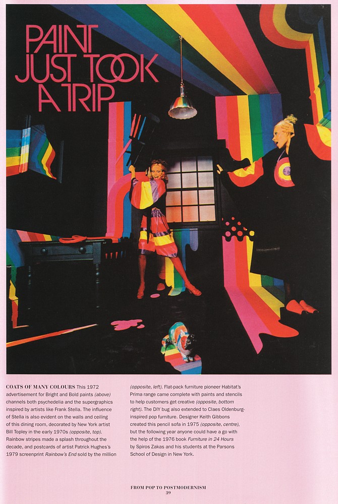
Amanda Lear in an advert for paint


Plus, high-gloss and high-sparkle are exactly what we need these days. And I don’t blame anyone choosing to jettison Gloomy Style and Design from their research, not least because the book would be twice the length and half the fun with those things included.

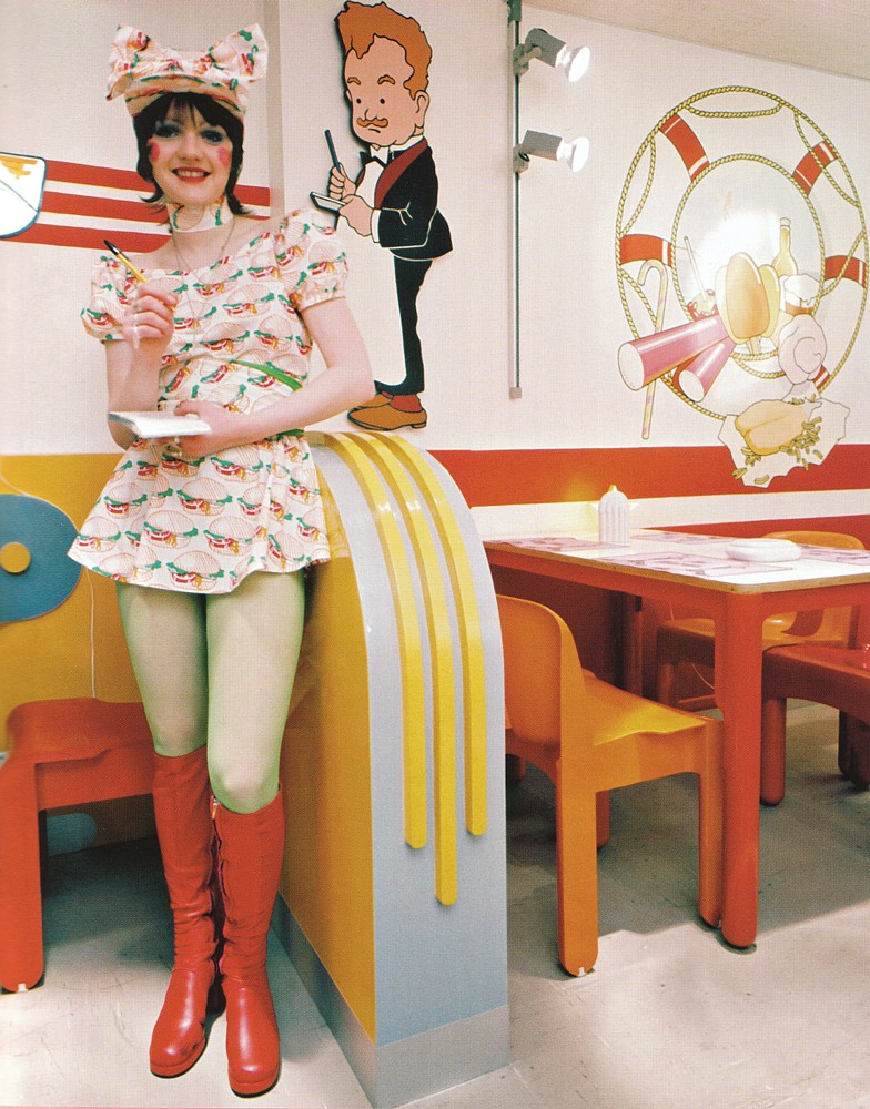
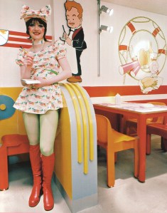
A waitress at ‘Mr Feed’em’


My second criticism, and it really is horribly specific, is the omission of Janice Wainwright. There! I said it was specific. If you want a pure-as-the-purest-spring-water example of the best of the Seventies aesthetic, I would say she was high up amongst the greats. Ossie, Biba, Mr Freedom, Bill Gibb are included, certainly, but Janice remains as yet unsung. In a book which gives us references to Universal Witness, Antony Price’s Plaza, Manolo Blahnik’s Zapata, Strawberry Studio and Kitsch-22, it seems a shame to leave anyone out!

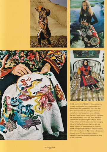
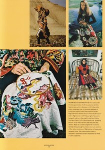
Mouth-watering textiles


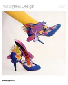
What I love about the design of the book is that there are plenty of full-page, high quality images which have never been seen before, interspersed with a more scrapbook-esque mish mash of visual references. Adverts, photoshoots, posters, labels; some are annoyingly small but it’s just so nice to see them all included without any detriment to the written word. The inclusion of many lesser-known designers and characters is quite wonderful; I hadn’t encountered Thea Cadabra and her incredible shoes (see front cover) before, and now I’m a bit obsessed.

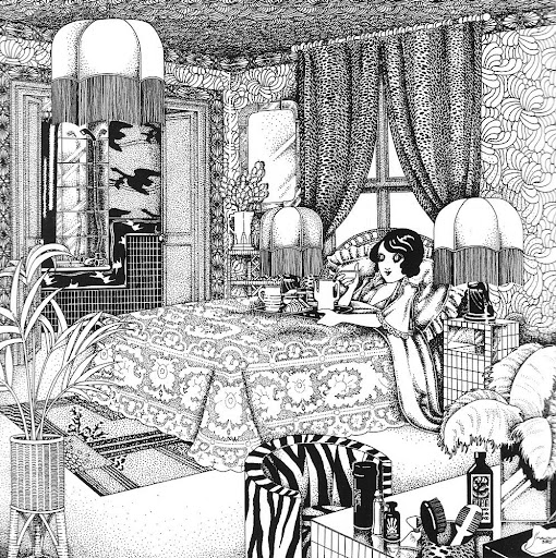
Also, any book which contains a half page reproduction of a Malcolm Bird illustration, the aforementioned full page photo of Noosha Fox and which uses the word ‘splendiforously’ is always going to take pride of place on my bookshelf.

Highly recommended for any vintage wishlist this Christmas (and beyond).

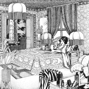
Malcolm Bird’s illustration for Biba

Inspirational Images: Pat Cleveland in Zandra Rhodes

1970s, Ed Pfizenmaier, Inspirational Images, pat cleveland, radical rags, zandra rhodes
Inspirational Images: Pat Cleveland in Zandra Rhodes
Pat Cleveland wearing a silk screened chiffon Zandra Rhodes caftan in the Manhattan residence of interior decorator Angelo Donghia.

Photographed by Ed Pfizenmaier.

Scanned by Miss Peelpants from Radical Rags. Early Seventies.

Inspirational Images: Joan Buck in Ossie Clark

1960s, celia birtwell, Inspirational Images, joan buck, ossie clark, radical rags

Joan Buck in Ossie Clark. Didier Duvall. Date unknown, late Sixties. Scanned from Radical Rags.

A delicious image in so many ways. A messy bed, creativity flowing, casually pulling on your Celia-print Ossie whilst looking into an impossibly tiny but beautiful mirror…

More Boyfriend menswear gorgeousness (plus Top Ten award!)

amen corner, boyfriend annual, menswear, psychedelia, ruffles, sixties, stripeyness, the herd

I think the Boyfriend 1969 annual might as well have been called the ‘Miss Peelpants Guide to How Men Should Dress’. Here are The Herd and Amen Corner, rocking the stripes and ruffles respectively.

I’m very chuffed to have put in an appearance in Cision’s Top 10 UK Vintage Clothing Blogs, and in such esteemed company as well. Very nice to get recognition from such a site, even if I don’t quite understand how I ended up there! Thanks Cision! Thision.

(That’s for for any Look Around You fans out there….)

576 Pages of Heaven: Lifestyle Illustrations of the Sixties

1960s, art deco, art nouveau, book reviews, Honey Magazine, Illustrations, petticoat magazine, psychedelia

This may, at first, look like the laziest book review in the world. I can be a lazy person, tis true, but I couldn’t really think of a better way to review such an extraordinary book. It needs to be possessed, to be pored over, to be appreciated en masse and to be studied in fine detail.

Lifestyle Illustrations of the ’60s by Rian Hughes is one man’s personal project to bring those unsung illustrators of the period to the attention of the wider world. If you’re anything like me, they are a source of great fascination and inspiration when you flick through a vintage copy of Honey or Petticoat. And if you were reading Womans Own et al back in the day, they would certainly have inspired daydreams from their fleeting representations of the magazine’s romantic short stories. They are often small in size, but incredible in skill, style and social comment. The timeline element of the book also allows you to see the development of social aspirations, fashion styles, illustration styles and inspirations (the clear references to art deco and art nouveau styles) and attitudes to morals and relationships.


When I find them in the magazines, I try to remember to scan them in. But I’m a bit forgetful, so this doesn’t always happen. When I first laid my eyes and hands on this book, it was like heaven. Someone else has gone to the trouble of scanning them in, cleaning them up and collating them by date and crediting the artist where possible. Consequently, it feels a bit weird to scan in pages and individual illustrations to illustrate my review. Firstly, there are just way too many and my scanner is a bit fiddly (coupled with a big heavy book, whose spine I’d rather not break just yet). Secondly, because I want you to go out and get a copy yourselves. Words and scans can’t really demonstrate what it’s like to flick through such a book. Each page inspires a cry of ‘ooooh, pretty’. Well, that’s my reaction anyway. Scans wouldn’t do it justice.

So I decided to sit and flick and take photographs of the most ‘ooh’-inspiring pages. Of course I had to give up after about 20 photos because I realised I would end up photographing the entire thing. But here are the collated images, just casually snapped so you get some feeling of what it’s like. Unsurprisingly, I’m most taken with the later period with the psychedelic, art deco and art nouveau influences, but I’ve tried to show you a cross-section of the entire book.

Now all they need is to put on an exhibition. There’s something lovely about having them all collated into a book, but it can lessen the impact of some solitary works of art. I would dearly love to see them displayed as large prints.