

Fresh, fine and tiny on white. Two views of the new hooded dress, both lissom and long and framed in a froth of bright feathers. By John Bates at Jean Varon.
Photographed by David Bailey.
Scanned by Miss Peelpants from Vogue, March 1969.

Fresh, fine and tiny on white. Two views of the new hooded dress, both lissom and long and framed in a froth of bright feathers. By John Bates at Jean Varon.
Photographed by David Bailey.
Scanned by Miss Peelpants from Vogue, March 1969.

Swag the rest in violet jersey: Jersey two-piece dress by John Bates.
Photographed by Michel Momy.
Scanned by Miss Peelpants from Vogue, March 1978.
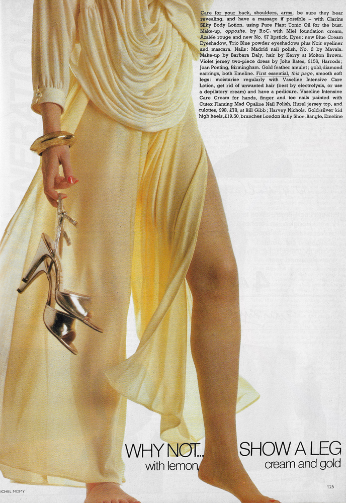
Why not… show a leg with lemon, cream and gold: Hurel jersey top and culottes by Bill Gibb. Shoes by Bally.
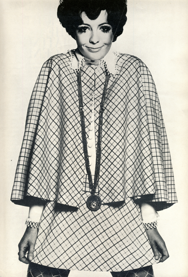
Left to right: Herringbone dress by Quorum, Ansdell Street; Striped dress by Quorum. Large Onyx ring from Palisades. Shoes from Lennards; Three-coloured gaberdine dress by Wallis; Wool jersey dress by John Bates at Jean Varon. Low heeled shoes by Character.
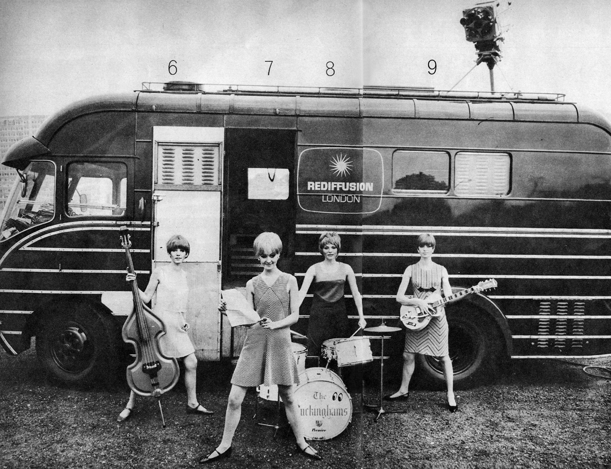
Television is a terrific stimulus to fashion. What Cathy McGowan wears on Ready, Steady, Go! may be in your High Street dress shop a matter of days later in a mass-produced copy. And John Steed’s immaculate Avenger image has played its part in the male peacock revolution. For our television issue here is an ‘outside broadcast’ collection of action clothes.
Produced by Prudence Glynn. Camera by John Beale.
Scanned by Miss Peelpants from Woman’s Mirror, October 1965.
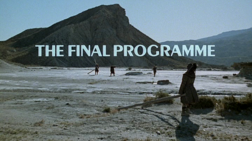
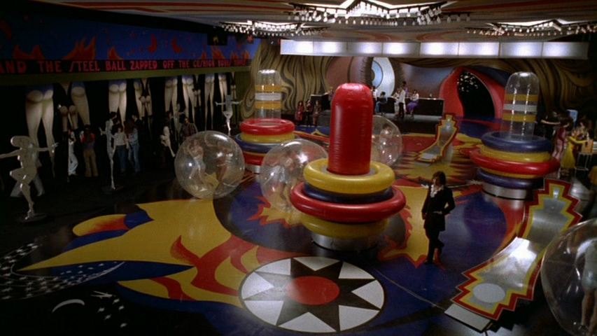
The Final Programme (1973) is a film I must admit I have been desperate to see for many years. Ever since I read that Ossie Clark and John Bates designed clothes for the leading man and lady respectively, but also because of the connection to The Avengers – courtesy of writer, designer and director, Robert Fuest. I am less familiar with the work of Michael Moorcock, so I hope that his fervent fans will forgive me for any ignorance and allow me to mainly rave about the aesthetics of the film.
It is a fascinating attempt to look at a future, distant or not – we are never entirely sure, without trying to be futuristic. In design terms, this is approached with an eye towards the Art Deco; which, possibly without realising, actually firmly establishes it as quite thoroughly Seventies in style. The designers chosen, Clark and Bates, are also notorious for their period tendencies, and the set designs are reminiscent of plenty of Vogue interiors features I have seen from the time. But, much like A Clockwork Orange, with a bit of distance (and when, like me, you think something looking ‘a bit Seventies’ can never possibly be a bad thing), this subtle Seventies-does-Thirties version of the future actually works perfectly. While the technology is a tad clunky, it is so highly stylised that you can actually believe that we might return to it someday.
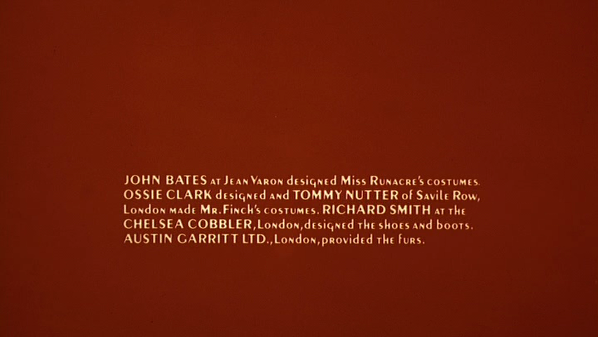
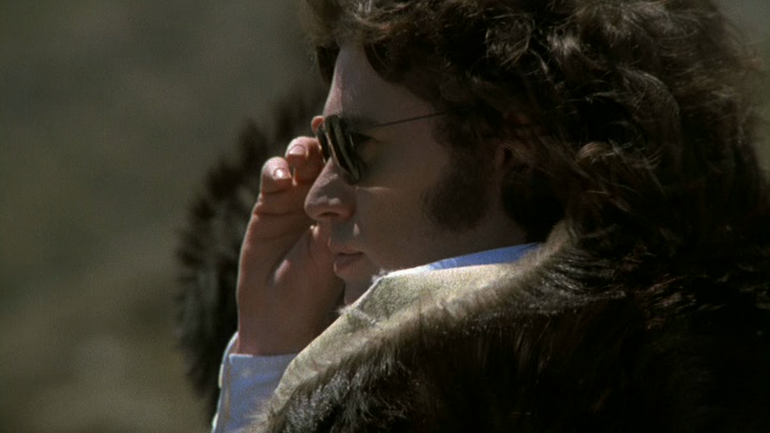
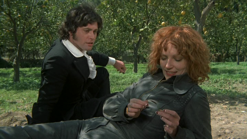
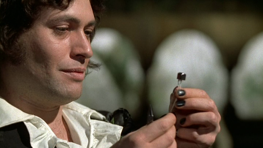
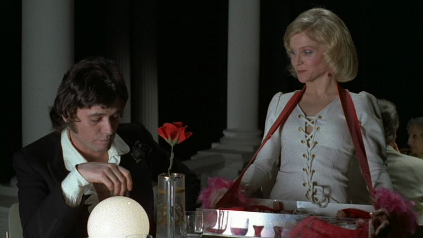
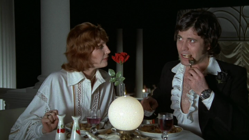
Dressed in Ossie Clark-designed Tommy Nutter-made suits, Finch swaggers around like an elegant hybrid of Ossie himself, Marc Bolan and Jim Morrison. Bouncy curls, sultry lips and just the right amount of chest hair on show. Laconic, cool, and admirably fond of biscuits, he is a perfect off-beat hero. It’s no wonder Jon Finch was considered for the part of James Bond, but it’s also no wonder that he turned it down. Jerry Cornelius is a far more interesting character to play; the humour is quirky and the fight scenes are playful – his movements more catlike. Bond is a thuggish oaf in comparison.
Jon Finch in The Final Programme
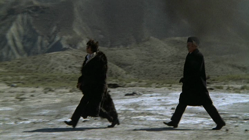
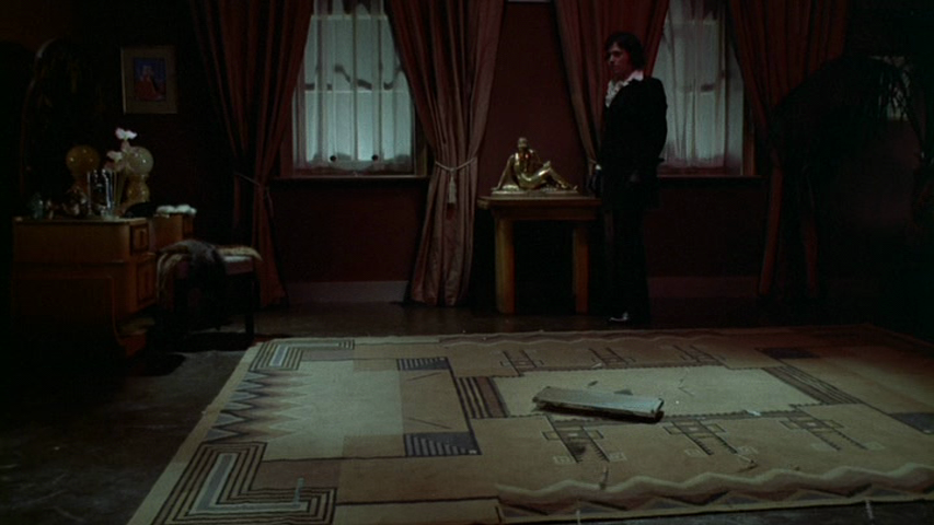
Cornelius is the ultimate Man in Black, slim and sleek. From the beginning, aside from an all-too-brief moment in a kaftan, he really only wears a sharply tailored black suit with a gently ruffled white silk shirt underneath. We first see him with a large fur coat over the top, which again is rather more reminiscent of a rock star than of a ‘hero’ – futuristic or otherwise, and a pair of simple aviator sunglasses. If there are subtle variations in his black suit, they are not made to be noticeable. But it also doesn’t feel like a rigid costume, just a signature choice. In a way, Clark has the harder task in designing a single ‘look’ which must run through and work within the design feel of the entire film: from the wilds of Finland, through his family’s perfectly minimalist Art Deco house and then to rural Turkey.
It is interesting to note that Ossie stated, in an interview from April 1969, that he was originally asked to do costumes for 2001: A Space Odyssey. The collaboration came to nothing, however, thanks to ‘disagreements’ between Clark and (presumably) Kubrick.
“I gave it up partly because the film company didn’t like my ideas, and didn’t think I knew what I was talking about.”
Ossie Clark, 19 Magazine April 1969
Of course Hardy Amies ultimately became the designer for 2001: A Space Odyssey, and it reinvigorated his career during a time when the likes of Ossie and John Bates were far more in demand. I see this as interesting, because this ‘futuristic’ film doesn’t attempt space age futurism in the way 2001: A Space Odyssey did. It does make you wonder if Ossie had decided that his brand of period-influenced design and quirky tailoring was the only way he wanted to design 2001: A Space Odyssey, and that – coincidentally – it was very much in keeping with the overall design by Fuest for The Final Programme.
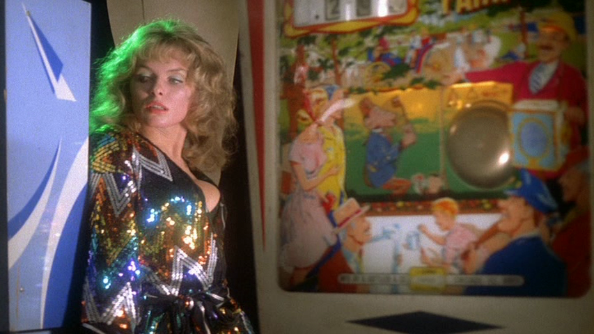
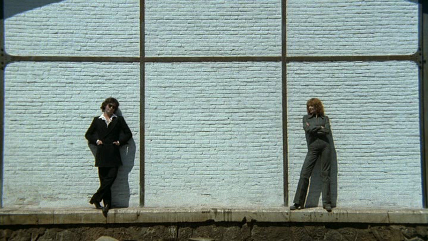
Julie Ege in The Final Programme
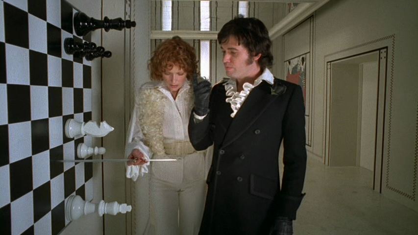
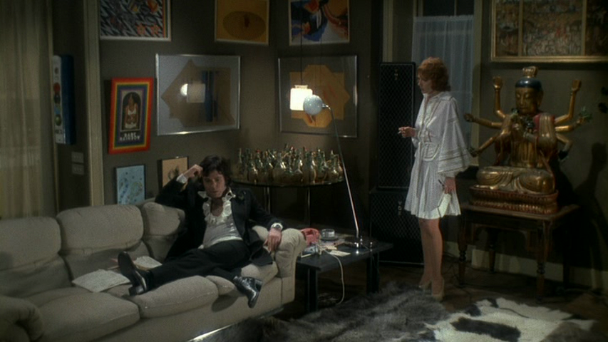
Jenny Runacre (below) is the lucky lady with the impossibly elegant (and predominantly white) couture John Bates wardrobe. Her ‘look’ is strikingly unusual for the time, and a perfect contrast to the brief appearance by Julie Ege (above), who is the perfect early Seventies dolly we see in a Mr Freedom, Pop Art-inspired sequence, and later to Sandra Dickinson’s kitschy, bottle blonde waitress. Runacre looks like a kind of hard bitch version of a Botticelli muse; big eyes and softly curled hair flat around her face, but with a gorgeously sneering voice and a cool air of superiority.
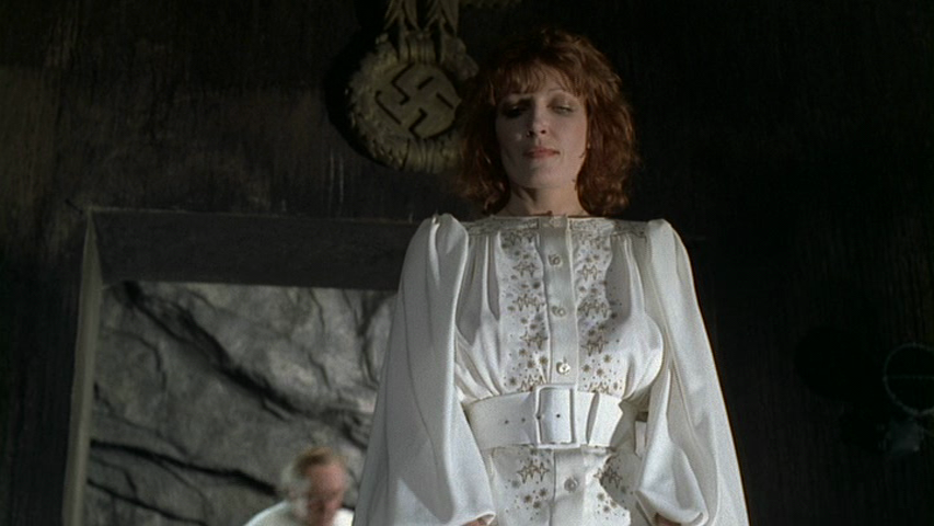
Jenny Runacre in The Final Programme
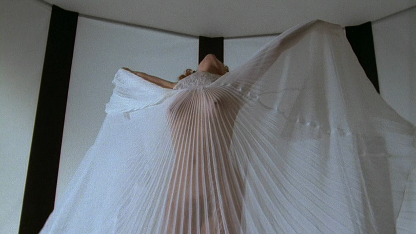
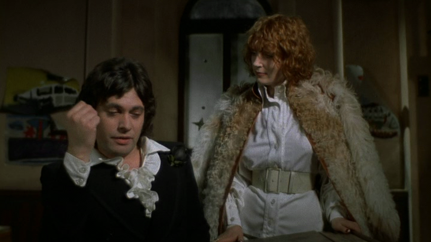
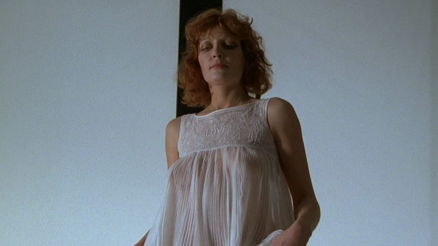
John Bates gets to have a lot more fun with his anti-heroine, who has considerably more costume changes than Finch, with a largely white palette and subtle variations on his billowing batwing shapes of the time. With boots by Richard Smith for The Chelsea Cobbler, and furs by Austin Garritt (with whom Bates often seems to have collaborated on leather, suede and fur designs at the time), her look is flawless from head to toe. The use of white feels like a conscious aspiration on her part, heavily connected to her vision for the future of humanity. But it also contrasts in a very basic way with the head-to-toe black of Cornelius; like a reverse of the black and white, evil and good, yin and yang cliché.
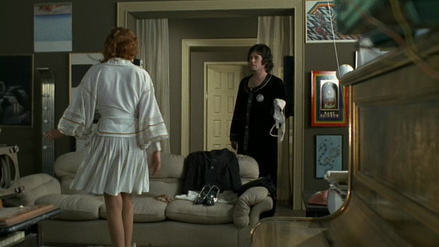
Jenny Runacre and Jon Finch in The Final Programme
It is interesting to contrast Bates’s designs for Miss Brunner with his more famous costume design stint for another strong female character: Emma Peel in The Avengers. Where Emma Peel’s clothes were feline, often cut sparingly and close to the body, Miss Brunner’s are billowing, voluminous and with more feminine detailing in trims and embroidery. Leather is replaced by suede, long-haired sheepskins replace rabbit fur in bold op-art patterns. Prevailing trends of the early Seventies, and a clear design direction by the two designers, mean that the roles are somewhat reversed; where the male protagonist is wearing skin-tight tailoring and revealing flashes of skin, the female is largely concealed until the denouement.
Jenny Runacre in The Final Programme
While there is no specific designer credited with the costumes of the more minor characters, the overall costume consultant – I was delighted to note – was one Marit Lieberson. Better known as Marit Allen (formerly of British Vogue and one of the most influential fashion journalists of the 1960s) Allen championed both John Bates and Ossie Clark early in their careers – wearing a design by the former for her wedding to Sandy Lieberson (also producer of this film) in 1966 – so the decision to use them so prominently in the film makes the most perfect sense.
It somehow feels like the combination of Fuest as production designer, Marit as costume consultant and two of the best British designers of the time, was a combination that couldn’t possibly lose. And yet, it did.
Despite the fact that The Final Programme has become something of a ‘lost’ film of the otherwise booming British film industry at the time, the overwhelmingly harmonious styling has secured it, for me, as one of the finest films of that period. I don’t see why A Clockwork Orange or Logan’s Run (both films of a very similar aesthetic and calibre) should both be so well-known, while this languishes in obscurity.
Jon Finch and Sandra Dickinson

Chelsea Girl
Tsk tsk. Slap my wrist. I’m pretty slack about putting website listings here on the blog, and I can only apologise. Here are some edited highlights (but there are plenty more already listed and more to come before Christmas!). Personal favourites are the original 1970s Chelsea Girl platform shoes, the black lace 1930s evening dress and Erte-printed John Bates for Jean Varon dress…

Unsigned original 1930s

John Bates for Jean Varon

Roland Klein for Marcel Fenez

Forbidden Fruit

Unsigned original 1960s

Terry de Havilland

Young Innocent

Lee Bender for Bus Stop

Wallis Fashion Shops

Miss Impact

Louis Caring

Unsigned original 1970s
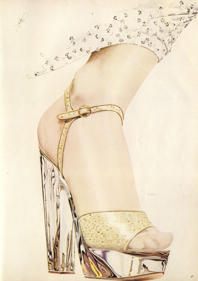
Perspex multi-speckled leather sandal, £35, Richard Smith for The Chelsea Cobbler. Spangled djellaba by John Bates at Jean Varon.
It’s a great shame that the perspex platform has become so indelibly linked with pole dancing and general modern “Made in China” market stall tat, because they had such a gorgeous pedigree from the Forties, and later in the Seventies. These are by the great Richard Smith for Chelsea Cobbler, beautifully hand-painted for Vogue by Michael English.
Scanned by Miss Peelpants from Vogue, August 1973
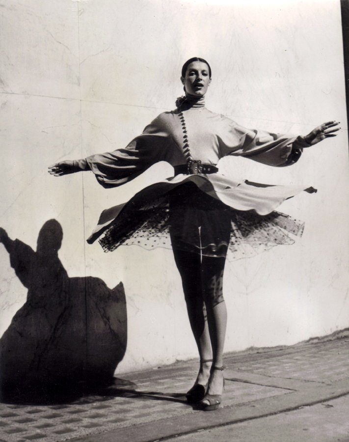
“Foxtrot” is the name of this creation from Jean Varon and Capricorn, Autumn-Winter 1972, with balloon sleeves and full skirt in double-knit banlon. The flare and lightness of the ensemble are rather like that of a ballet dress. All the lovely Michele is missing are the pointe shoes…
12th September, 1972. AGIP photo. Scanned by Miss Peelpants.

Ossie Clark
It’s been quite a while since I last posted about goodies over at Vintage-a-Peel. This blog has moved slightly away from its original intention as a communication and promotional tool for the website, which is fine by me because I genuinely love what it has become. Also, the Facebook page for Vintage-a-Peel, and Twitter, has become the fastest method for me to communicate with customers. But I realised that I’ve listed some incredible pieces recently which blog viewers might be interested in, and which they might have missed. So here they are; Biba, Ossie, John Bates, Fiorucci (incredibly rare late 1960s jeans), London Mob, Paraphernalia, Janice Wainwright, and that’s just the big names. Plenty more to be found over on that there website of mine…

John Bates for Jean Varon

Fiorucci

Biba

Paraphernalia

London Mob of Carnaby Street

Janice Wainwright for Simon Massey
Outfit by John Bates for Jean Varon
Photographed by David Bailey. Scanned by Miss Peelpants from Vogue, January 1968
Dress by Jean Muir – shoes by Rayne
Dress by Liza Spain at Vanessa Frye – shoes by Charles Jourdan

Photographed by Barry Lategan
“It all begins and ends with the girl. There’s no such thing as a ‘sexy’ dress – it’s just so much fabric until it’s on the body. The look depends so much on the wearer. You have to keep in mind that some stage in the day it’s all got to come off. You see, I’m a realist.”
Oh yes! It’s another wonderful installment of ‘The Opinionated Mr Bates’* – see also here and here
“There’s a lot of rubbish talked about women dressing to please themselves or to impress other women. Women dress to please men. It’s for men that they keep themselves in shape, try out new make-up, change their hair. But it’s a very sad thing when a woman is frightened to move from what she knows her man likes. You can see it so clearly with wives and husbands; she suddenly ‘freezes’. Clever women know that by always looking the same you gradually make yourself invisible. That’s why I like to dress actresses – they’re not afraid to change and make men look at them with pleasure all over again. So each time I design a collection I make it new, concentrate on a different zone of the body… this time it’s the shoulders and arms, a way of cutting and gathering the sleeves.
“I think London women look better than anyone in the world. I admire the way Americans care, but it shows a little, and it shouldn’t. They’re best when they’re wearing the least make-up, and their hair shines like they invented shampoo, but come the witching hour of four o’clock… they’re hilarious. The French have a great way with shirts and sweaters and skirts, but we’ve been admiring that for thirty years. They’re inhibited- they won’t try something new. The English can be quite mad one day and very chic the next, and do it without any visible effort. Since the ‘sixties we’ve been enjoying fashion in a way that’s unique.
“I never want to hear the word ‘layers’ again. Let’s see the shape, let’s see it moving. I’m not talking about teenagers. I saw a woman who must have been 80 in one of my dresses at a party recently and the dress had a low neck. That could be a recipe for disaster, but it wasn’t. She looked great because she was thin and cheerful, she stood well, she’d looked after herself.”
Scanned by Miss Peelpants from Vogue, February 1976. Photographed by Barry Lategan. All clothes by John Bates.
*I say this with tongue firmly in cheek, of course. I worship the man…

Photographed by Barry Lategan
